


Like I said the other day, the first chunk from the second Minivandians book is out to the alpha readers. I had a bit of time this evening, so I started work on its cover.
What do you all think?
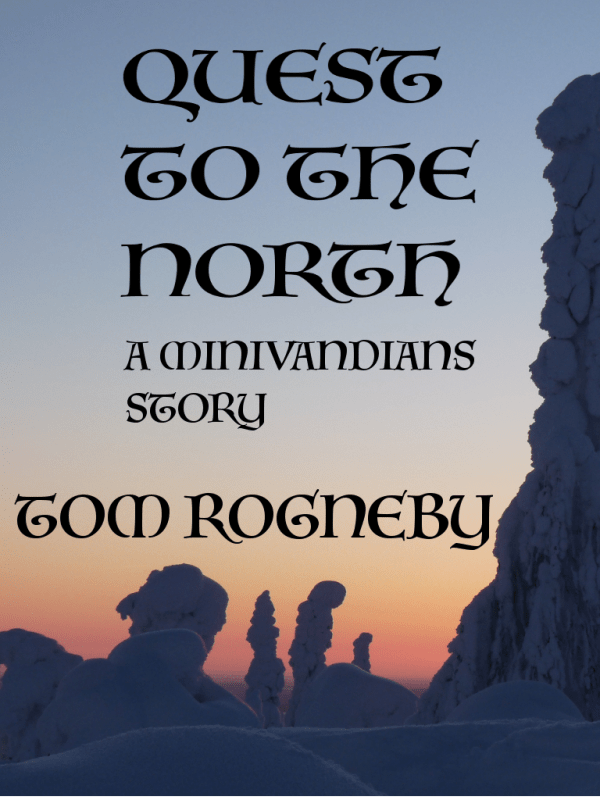
Or maybe this:

They probably need a little tweaking, but I kind of like both of them. They fit the story in the first novella.
As always, feedback is appreciated.

Joshua Tolley
/ October 28, 2016I much prefer the first. The letter spacing on the second seems far too wide, and I’m not fond of the dotted “i” in that text style.
LikeLike
daddybear71
/ October 28, 2016Thanks. That was my first preference, but others are pointing out that this find is rather hard to read in the 1 to 2 inch picture Amazon will show customers on their website. I may try to find something similar that is a bit more readable.
LikeLike
John in Philly
/ October 29, 2016I found both styles hard to read. Maybe a change from all caps to upper and lowercase would help.
If you change to upper/lower case then maybe use a more interesting font for the uppercase, in the the style of an illuminated manuscript, and then use a font for the lowercase that is both easier to read, and grabs more attention.
Also the grey tones of the photo made it a little bit hard to recognize that it was snow instead of rock formations.
Cedar Sanderson has written about cover design on a couple of occasions.
http://cedarwrites.com/covers-and-writing/
LikeLike
daddybear71
/ October 29, 2016Thanks!
LikeLike